Ecommerce insert buying guide
Custom Thank You Cards: 9 Print Mistakes That Make Packaging Look Cheap
Make a small card feel genuinely personal—and prevent print, QR, paper and proofing errors before volume.
Short answer: The best custom thank you cards fit the packed order, use readable type on a suitable paper stock, carry one genuine message and survive the packing process without scuffing or curling. Approve size, artwork, print, finish and any QR code on a physical proof before ordering volume.
A thank-you insert is small, but it is one of the few pieces of packaging a customer may read from start to finish. Done well, it confirms the human behind the order and gives one useful next step. Done badly, it feels generic, creates waste or makes an otherwise polished unboxing look cheap.
This guide turns Semrush research for custom thank you cards into a practical buying process for ecommerce brands. It focuses on business packaging inserts—not wedding or funeral stationery—and separates design taste from the production checks that prevent expensive reprints.
To compare formats, start with Stowliva’s embossed thank-you cards, custom cards from 100 pieces and foldable custom cards. The right option depends on message length, packing space and the action you want the customer to take.
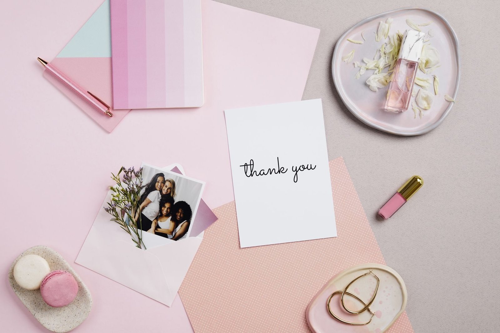
Custom thank you card formats compared
Choose the format after you know the job. A flat card is efficient for a short note, while a folded card gives private space for care instructions or a handwritten line. Embossing can add tactility, but only when the mark remains clear on the chosen stock.
| Format | Best use | Production benefit | Main watch-out |
|---|---|---|---|
| Flat card | Short thanks, care tip or referral prompt | Fast to pack and easy to print in batches | Too much copy quickly becomes unreadable |
| Folded card | Longer story, gift message or handwritten note | More writing area without a larger footprint | Fold direction, cracking and packed thickness |
| Embossed card | Premium, restrained presentation | Tactile brand cue without full-coverage ink | Fine detail can disappear on soft or textured stock |
| Seasonal version | Holiday drops and limited campaigns | Creates a timely unboxing moment | Leftover dated inventory becomes obsolete |
1. Starting with decoration instead of a single job
Decide what the card must do before choosing a color, foil or illustration. Its primary job might be to reassure a first-time buyer, explain product care, invite a review, encourage a second order or make a gift feel personal. Pick one main action. When a card asks for a review, a follow, a referral, a survey and another purchase, none of those actions feels important.
Write a one-sentence brief: “Thank a first-time customer and point to care instructions,” or “Help a gift recipient understand who sent the order.” That sentence becomes the test for every element. It also helps you decide whether a card is the right insert or whether the information belongs on a seasonal card, product label, receipt or web page.
2. Using generic copy customers can feel immediately
“Thank you for your order” is clear, but it rarely sounds owned. Add one specific detail that reflects the buying moment: the item was packed by a small team, the maker hopes it becomes part of a daily ritual, or the brand is grateful the customer chose an independent business. Specificity creates warmth without requiring a long founder story.
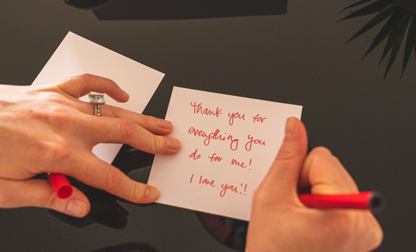
Keep the printed core evergreen, then leave a deliberate place for a name, initials or one handwritten sentence when operations allow. Test the pen on the finished stock; glossy coatings can smear and absorbent uncoated stocks can feather. A printed imitation of handwriting often feels less personal than clean type plus one real mark.

3. Choosing size before testing the complete packout
Measure the available space inside the actual shipped order, not an empty box on a design desk. Include tissue, product sleeves, instructions, samples and the closing method. A card that is too large bows over the product or hides the first visual moment; a card that is too small can disappear under tissue or into a mailer seam.
For standard paper proportions, ISO 216 defines the A and B series of trimmed sizes. You do not have to use an ISO size, but a recognized format can simplify envelopes, cutting and future versions. Make a plain paper dummy at 100% scale, pack ten real orders and watch where staff naturally place it before locking dimensions.
4. Treating paper as a color swatch
Paper affects print density, fold quality, handwriting, perceived weight and even whether an embossed mark reads clearly. Ask for stock name, weight or caliper, surface, shade, recycled-content percentage and any certification claim. Compare samples under the light in which customers are likely to open the parcel, not only under a bright monitor.
For sourcing discussions, the Forest Stewardship Council’s paper and packaging guidance explains how FSC certification and chain of custody relate to forest-based materials. The U.S. EPA’s greener paper guidance also describes recycled content and other purchasing considerations. Neither source makes a particular card responsible by default; request evidence for the exact stock and claim you intend to print.

5. Sending artwork without bleed, safe zones or a final size
A printer cannot infer a finished size from a social graphic. Set the trim size first, extend background artwork beyond the trim and keep text and logos inside a safe area. Adobe’s guide to printer marks and bleed explains why artwork that reaches the edge needs extra image area to allow for cutting variation.
Provide editable vector logos, outlined or packaged fonts, high-resolution images and named brand colors. Export the approved production PDF using the printer’s requested preset. Adobe’s print-ready PDF guidance recommends checking fonts, linked graphics and output settings before handoff. Stowliva’s artwork guide gives a useful supplier-ready checklist.
6. Making the text attractive but hard to read
Tiny type, low contrast and script fonts often look elegant on screen and fail on textured paper. Print the design at actual size on an ordinary office printer, hold it at normal reading distance and ask someone outside the project to read every line. Check that the hierarchy still works in warm indoor light.
Use one display style sparingly and a plain typeface for instructions, URLs, discount terms or care notes. Avoid placing essential text across a fold, embossed area or heavy texture. If the reverse carries compliance or material information, give it the same readability standard as the front.
7. Adding a QR code without testing the printed object
A QR code should lead to one durable, useful destination: care instructions, a review flow, a reorder page or the story behind the product. Use a redirect you control so the destination can change without reprinting the card. Add a plain-language label such as “Scan for care instructions”; a mystery square gives customers little reason to act.
DENSO WAVE, the QR Code developer, specifies a quiet zone of four modules around the code in its QR Code basics. Its generation guidance also shows that symbol size depends on data and error correction. Test production proofs with several phones, at arm’s length and under glare. Do not place the code over a fold, foil edge or busy photograph.
8. Approving a screen proof instead of a physical sample
A PDF can confirm wording and position, but it cannot show paper feel, emboss depth, coating, metallic reflection, fold cracking or how ink sits on a textured sheet. Request a material swatch and, when the finish or color matters, a production-intent proof. Check it beside the product, tissue and outer package.
Build an approval list: finished size, paper, grain or fold direction, color reference, print sides, bleed, trim, emboss or foil position, coating, QR scan and packing orientation. Sign and date the approved file and sample. If several markets or messages share one order, use a version code in a non-customer-facing area so cartons and inserts cannot be mixed.
9. Making environmental claims broader than the evidence
Words such as “green,” “planet-friendly” or “zero impact” say more than a paper specification can normally prove. The U.S. Federal Trade Commission’s Green Guides summary advises marketers to qualify broad environmental claims and substantiate recycled-content, recyclable and other objective statements.
State the attribute you can document—for example, a defined percentage of recycled content or a certification applying to the supplied stock—and keep records with the order. Review ink, coating, foil and adhesive before making a disposal claim about the finished card. Stowliva’s materials overview can help frame the questions, but the purchase specification and supporting documents should control the final wording.
A quote-ready card specification
- Card job, target customer, main message and one desired action.
- Flat or folded finished size, orientation and packed position.
- Paper name, weight or caliper, shade, surface and claim evidence.
- Print sides, color references, embossing, foil, coating and writable area.
- Final artwork, bleed, safe zone, fonts, image resolution and version code.
- QR destination, visible call to action and scan-test conditions.
- Quantity by version, acceptable tolerances, packing and carton labels.
- Proof type, approval owner, lead time and reorder plan.
Use the custom MOQ guide to plan versions without creating obsolete stock. If the insert must coordinate with the full unboxing, review Stowliva’s custom packaging options before approving the card alone.
Frequently asked questions
What size should a custom thank you card be?
Use the smallest size that keeps the message readable and sits predictably in the packed order. Test a paper dummy with the product, tissue, instructions and closure rather than choosing from screen proportions.
What should a business write on a thank-you card?
Thank the customer in the brand’s real voice, add one specific human detail and offer one useful next step. A short, sincere message usually works better than several promotional requests.
Which paper is best for handwritten notes?
An uncoated or suitably writable stock is often easier to use, but pens behave differently. Test the exact pen, ink drying, feathering and show-through on the production stock.
Should every thank-you card include a discount?
No. Discounts can train repeat buyers to wait for an offer. Care help, a reorder shortcut, a meaningful referral or a personal note may create more value for the customer and the brand.
How do you proof custom cards before printing?
Approve content and preflight digitally, then inspect a physical proof when stock, color, fold, embossing, foil, coating or QR performance matters. Pack the proof with a real order before bulk approval.
Next step: Send the finished size, message, paper preference, artwork, print and finish, quantity by version and packed-order photo through Stowliva’s custom packaging quote form. A complete brief makes samples and supplier quotes comparable.
Editorial note: Five newly sourced, licensed real photographs illustrate this article. Product specifications, certification scope and claims must be confirmed for each order.