Branded finishing production guide
Custom Printed Ribbon: Will Your Logo Read Clearly? 9 Checks
Match width, artwork, color reference and print method to the real package before production begins.
Custom printed ribbon can turn a plain box, pouch, bouquet or retail bag into a recognizable brand moment. It can also waste budget when the logo is too small, the repeat disappears into a bow, the screen color is treated as a print guarantee, or the material is chosen before anyone tests the actual packout.
What should brands decide before ordering custom printed ribbon?
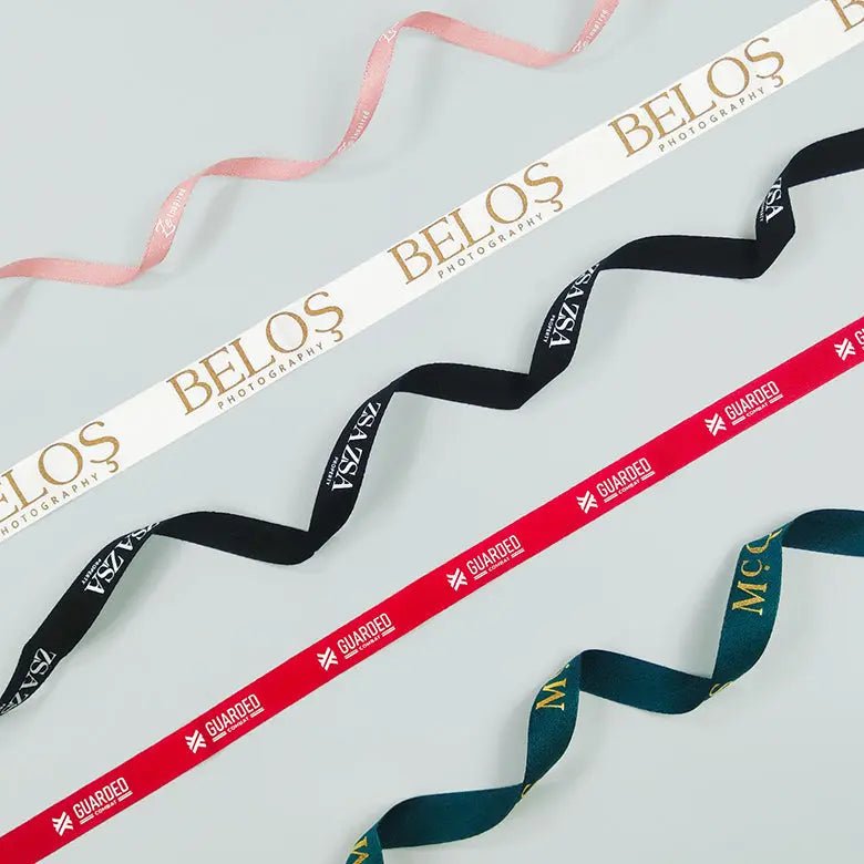
Start with the use: bow, flat band, bag handle, tag tie, product bundle or decorative accent. Then define package dimensions, viewing distance, handling and the moment when the logo needs to be visible. A ribbon that photographs beautifully when flat can hide its mark inside a knot. A wide ribbon can overwhelm a small jewelry box. A narrow one can make a detailed wordmark unreadable.
Use a full-size mockup and a real package before requesting production. Stowliva’s one-color custom ribbon and two-color ribbon option show useful format directions, but the right choice still depends on the artwork and use.
Mistake 1: choosing ribbon before defining the packaging use
Satin, grosgrain, cotton-like and paper-based ribbons do not behave the same way. Some form soft bows; some hold a structured loop; some show creases; some absorb or soften print. If ribbon will serve as a handle, abrasion and load matter. If it will close tissue, knot bulk and packing speed matter. Put the task before the finish.
Write a one-sentence use statement: “This ribbon will wrap a 10-inch rigid gift box, cross at the underside and form a visible top bow.” That sentence gives the supplier more actionable information than “We need premium ribbon.” It also helps the team compare a ribbon with other packaging products as one system.
Mistake 2: selecting the wrong width
Width controls proportion, knot volume and printable height. Before ordering, cut paper strips in the candidate widths and wrap the actual box. Place the logo at its intended size. View the package from normal distance and take a phone photo. If the mark only works when the proof is enlarged on screen, the design is not ready.
Do not assume the nominal width equals the full printable area. Edge margins, process limitations and fabric movement can reduce the safe zone. Ask for the supplier’s artwork template. For a 19 mm direction, review a real 19 mm custom ribbon product and then test your own logo rather than copying the sample layout.
Mistake 3: ignoring logo aspect ratio and repeat spacing
A long wordmark, stacked logo and circular monogram require different repeats. If the ribbon is cut into short lengths, the repeat must give each piece a reasonable chance of showing the mark. If it is tied, the design should survive the knot, tails and changing viewing angle. Ask for logo height, repeat length, orientation and gap as explicit proof dimensions.
Test at least three cut positions. Tie a bow from each and check whether one position creates a blank front. If the primary logo is too long, an approved monogram or symbol may perform better. Preserve brand rules while adapting the lockup to the physical canvas.
Mistake 4: sending low-resolution raster artwork
A screenshot or small JPEG can look sharp in an email and still print with soft edges. Adobe’s explanation of raster versus vector artwork shows the key distinction: vectors can scale without the pixelation associated with enlarging raster images. For logos and type, provide an AI, EPS, SVG or editable PDF when the supplier accepts it.
Outline fonts or include the licensed fonts as requested, keep a live master file, and send only approved logo variants. If a raster element is unavoidable, confirm resolution at final size—not the pixel dimensions in isolation. Ask the printer to flag thin lines, small counters and knockout text before proof approval.
Mistake 5: treating screen RGB color as a physical print standard
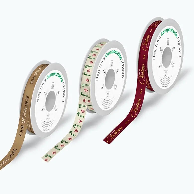
Screens emit RGB light; printing uses inks, dyes, pigments or foils on a physical surface. Adobe’s current overview of RGB and CMYK color modes explains why colors can shift when moving from screen to print. Ribbon texture and sheen create another variable: the same ink can feel brighter on glossy satin and softer on a textured surface.
When color matters, provide a recognized physical target and define the viewing conditions. Pantone’s Color Bridge guide is designed to compare spot colors with CMYK approximations on coated stock, but ribbon is a different substrate; use the reference as a target, not a guarantee. Pantone’s overview of color spaces is also a useful primer for aligning design and production conversations.
Mistake 6: using tiny type, hairlines or intricate artwork
Ribbon is a narrow, moving, textured surface—not a brochure. Tiny type can fill in, fine reverse lines can close, and delicate marks can break across grosgrain ribs. View the proof at 100% physical size and print a paper mockup. If a customer cannot read the mark at the expected viewing distance, simplify it.
Place required product information elsewhere. A hang tag or packaging insert is usually a better home for long copy, instructions, URLs or care information. Let the ribbon do one job well: identify and finish the package.
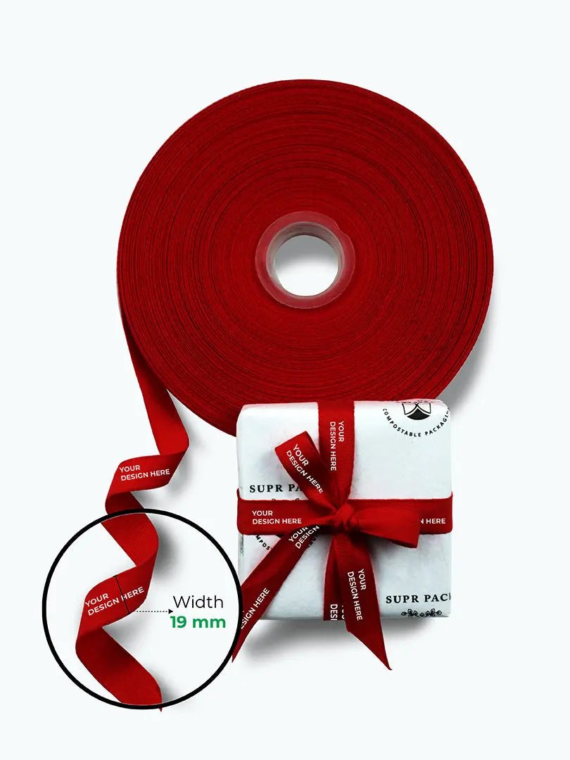
Mistake 7: mismatching print method to ribbon substrate and handling
Ink printing, foil, transfer and other supplier-specific methods differ in detail, opacity, hand feel, flexibility and durability. A process that produces a crisp result on smooth satin may not suit a fibrous or ribbed ribbon. International process-control standards such as ISO 12647-6 for flexographic printing illustrate why substrate, ink and process conditions belong in the same production conversation.
| Ribbon direction | Look and feel | Artwork direction | Test before approval |
|---|---|---|---|
| Satin | Smooth, glossy, fluid | Can support clean marks; sheen changes perception | Creasing, opacity, bow behavior and color |
| Grosgrain | Ribbed, structured, matte | Bold shapes usually survive texture better | Fine lines across ribs and cut-edge behavior |
| Cotton-like | Soft, fibrous, natural | Expect a softer edge than on a smooth surface | Absorption, rub, shrinkage and color |
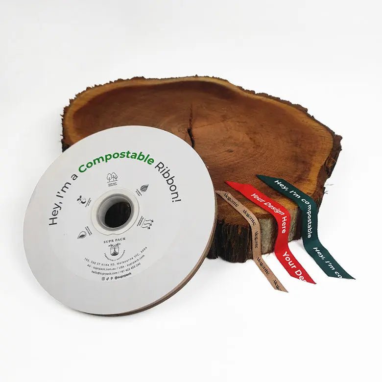
| Paper/compostable direction | Often matte or rustic | Simple, high-contrast work is safer | Claim evidence, flexing, tearing and disposal conditions |
This table is a starting point. The exact material, coating, ink system and equipment determine the result. Ask for method-specific limitations and test the decorated ribbon in the way customers and fulfillment staff will handle it.
Mistake 8: making unsupported recycled, biodegradable or compostable claims
A material name does not prove a complete ribbon, ink and finish will behave in a particular end-of-life system. The FTC’s Green Guides require marketers to have a reasonable basis for environmental claims and to qualify limitations clearly. Ask for composition, claim scope, test method, certification where applicable and the disposal conditions before writing marketing copy.
If forest-based sourcing is part of the message, learn how FSC chain-of-custody certification and trademark controls work. Do not place a certification mark on the strength of a verbal assurance. Precise wording such as a verified percentage or a named material is more useful than a vague “green” label.
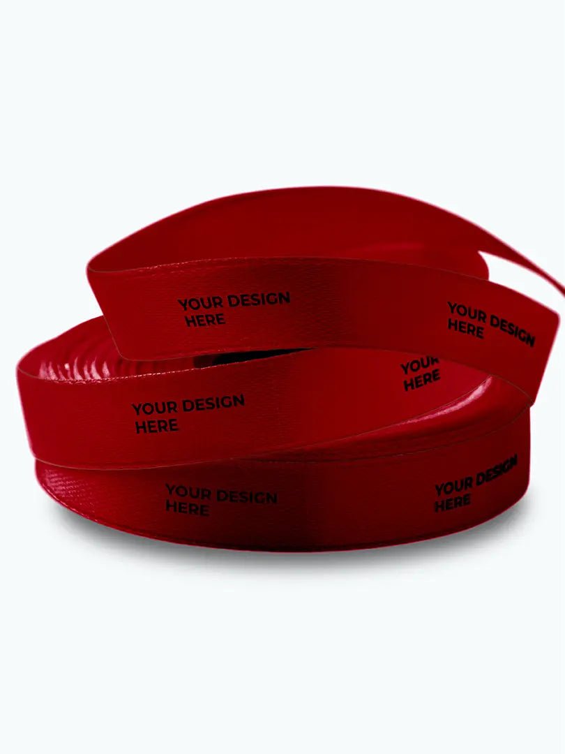
Mistake 9: approving only a digital proof
A PDF can confirm spelling, logo orientation and repeat measurements. It cannot reproduce hand feel, sheen, ink opacity, foil reflection, bow behavior or physical color. For a launch, retail program or high-visibility gifting project, approve a representative physical sample when feasible. Keep it as the production reference.
On receipt, inspect samples from more than one roll and carton. Check width, print position, repeat, legibility, color, visible defects, edge quality and performance in the actual packout. Define what is acceptable before production so teams do not improvise standards after the goods arrive.
Width and artwork checklist
- State the use: bow, flat wrap, handle, tag tie or bundle.
- Measure the real package and test candidate widths at actual size.
- Confirm printable height, edge margins, logo height and repeat length.
- Supply scalable vector artwork and the approved logo variant.
- Remove tiny type, hairlines and unnecessary detail.
- Provide a physical or standardized color reference where color is critical.
- Match print method to substrate, handling and desired appearance.
- Verify every sustainability statement against current documentation.
- Approve a physical sample and record incoming inspection criteria.
Coordinate ribbon with the complete unboxing sequence. Stowliva’s custom tissue paper guide and custom packaging service can help teams plan the layers together.
Frequently asked questions
Do I need vector artwork for custom printed ribbons?
Vector artwork is usually the most reliable format for logos and text because it scales cleanly. Confirm the supplier’s accepted formats, fonts, color separations and minimum detail rules.
Can ribbon match my brand color exactly?
A supplier can work toward an approved target, but material, ink, finish, lighting and process tolerance affect appearance. A physical sample on the selected ribbon is the best approval reference.
What width is best for a logo?
The best width depends on the logo’s aspect ratio, printable area and package proportion. Test the mark at actual size and tie the ribbon before choosing.
Is compostable ribbon always the better option?
No single material is automatically best. Consider product protection, use, transport, composition, printing and the realistic disposal route, then make only claims supported by documentation.
Is a digital proof enough?
It is enough to check layout mechanics, but it cannot fully predict color, texture or handling. Use a physical sample when those factors carry meaningful commercial risk.
Turn the brief into a useful sample
Strong custom ribbon printing begins with a real package, a clear use statement and artwork that respects the narrow surface. Send the checklist with your dieline or package dimensions, select two plausible material-width combinations and request samples and a quote. The objective is not a pretty proof; it is a repeatable result that works in fulfillment and in the customer’s hands.
Primary references
The technical and environmental guidance in this article is grounded in the Adobe, Pantone, ISO, FTC and FSC resources linked above. It is general production guidance; confirm specifications and legal claims for the exact ribbon and target market.
Editorial note: The five images are existing Stowliva catalogue photographs of real products, not AI-generated artwork. Product specifications and claims should be confirmed for each order.