Custom label production guide
Custom Embossed Stickers: Will Your Logo Emboss Cleanly? 7 Checks
Match artwork, paper, relief, foil and adhesive before approving your custom label run.
Quick answer: A successful embossed sticker is designed as a three-dimensional label from the start. Choose embossing, debossing or foil for a specific visual job; simplify fine details; match paper and adhesive to the package; then approve a physical proof on the real container. A screen preview cannot reveal depth, cracking, edge lift or registration.
Embossed stickers create a tactile focal point without requiring a fully custom box. That makes them attractive to beauty, food, candle, jewelry and gifting brands—but the finish also exposes weak artwork and unsuitable materials. This guide uses Semrush research around embossed stickers, custom embossed stickers and embossed product labels to answer the questions buyers search before ordering.
What is the difference between embossing, debossing and foil?
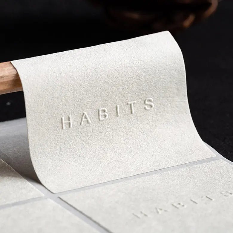
Embossing raises selected areas above the label surface. Debossing presses them inward. Blind embossing uses depth and shadow without printed ink or foil in the raised area. Foil stamping transfers a colored or metallic layer, and registered foil plus embossing attempts to align that layer with the raised shape. Printed plus embossed labels combine ordinary printed information with selected tactile details.
None is automatically more premium. The right process depends on the design’s purpose. Blind embossing can suit a quiet monochrome identity; foil can create reflected contrast; debossing can feel restrained; and printed plus embossed construction can keep small information readable while emphasizing a logo. Compare the real examples in Stowliva’s blind custom embossed stickers, embossed label rolls and printed foil embossed stickers.
| Finish | Surface effect | Useful when | Main approval risk |
|---|---|---|---|
| Blind emboss | Raised paper, no added color | Texture and subtle shadow are the focus | Effect can disappear on unsuitable stock or in flat light |
| Deboss | Recessed impression | An understated pressed-in mark supports the identity | Depth and reverse-side show-through need review |
| Foil + emboss | Reflective layer aligned to raised detail | The logo needs shine and tactile emphasis | Registration, cracking and foil coverage |
| Print + emboss | Printed color with selected raised zones | Information and tactile branding must coexist | Color, emboss and die-cut alignment |
7 costly embossed sticker mistakes to avoid
1. Using emboss, deboss and foil as interchangeable words
A vague brief produces mismatched expectations. Mark each artwork layer with the intended process and provide a simple visual legend. State whether the embossed zone is blind, printed or foil stamped, and whether the supplier should recommend depth. If both foil and embossing are used, ask how registration tolerance will be reviewed on the physical proof.
2. Choosing paper for color while ignoring its structure
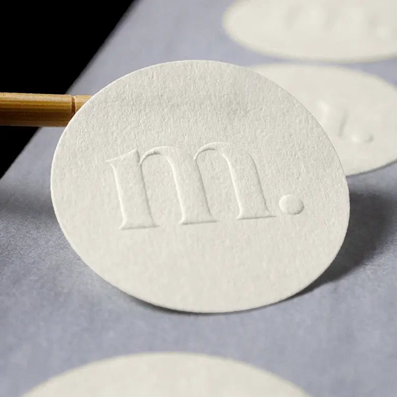
Embossing reshapes the stock. Fiber composition, thickness, coating, texture and grain influence how cleanly the detail forms. A heavily textured sheet can compete with a subtle logo. A brittle coating can crack at a sharp raised edge. A very flexible stock can lose definition or behave poorly on a curve.
If a paper or forest claim appears in the brief, verify it separately from the visual finish. FSC’s chain-of-custody requirements explain how certified material claims move through a supply chain; a paper’s appearance alone does not establish certification. Ask for the exact material description and applicable evidence before placing a mark or claim on packaging.
3. Sending tiny lettering, thin lines or crowded texture
A fine vector line can exist mathematically but still fail physically. The die, paper and emboss depth need enough width and spacing to form recognizable edges. Counters inside letters can close; closely spaced lines can merge; and small reversed type can become uneven. Simplify the tactile layer, enlarge critical marks and let flat printing carry small legal or product information.
Submit editable vector files through the Stowliva artwork guide. Outline fonts only after spelling and licensing are checked, keep a live master file, and label spot colors and production layers clearly. Ask the manufacturer for process-specific minimum line, gap and type-size rules rather than copying a value from an unrelated printing method.
4. Omitting quiet space and edge clearance
Embossed details need room to be seen and formed. A raised element close to the die-cut edge may distort, and a narrow border can make normal registration variation look obvious. Provide a bleed for printed backgrounds, keep essential details inside the safe area and leave clear space around the tactile focal point.
Adobe’s guide to printer’s marks and bleeds explains why artwork extends beyond the trim edge, but the final bleed and safe-zone values must come from the sticker supplier’s dieline. If the design uses transparency or effects, review Adobe’s print-transparency guidance and provide a production PDF plus the editable source.
5. Choosing adhesive after the design is finished
The adhesive determines whether the label stays attached. Glass, coated board, flexible film, low-surface-energy plastics and textured mailers behave differently. Curvature, cold, moisture, oil, abrasion and storage time also matter. A beautiful label that lifts at the edge damages the intended impression.
Test the finished embossed construction on the actual package, not a convenient flat sheet. Apply it using the real hand or machine process, allow the agreed dwell time, then inspect for edge lift, bubbles, sliding and distortion. If the label must be removable, say what clean removal means and after how long. Stowliva’s custom product label rolls provide another format to compare when application efficiency matters.
6. Approving color or foil only on screen
Displays emit light; printed surfaces reflect it. Paper shade, coating, ink film and illumination change perceived color. Foil changes again as the viewing angle moves. Pantone’s color-systems overview explains why different materials and production contexts use different systems. Agree on a physical reference, viewing conditions and acceptable production tolerance.
Flexographic labels may also be specified against industry process-control standards. ISO 12647-6 addresses process control for flexographic printing, while ISO 12647-7 covers proofing processes working from digital data. These standards do not replace a buyer’s approval criteria, but they illustrate why a proof should be tied to a defined process rather than judged as “looks close.”
7. Skipping the physical proof and batch check
A digital proof can confirm layout, spelling and separation names. It cannot show emboss depth, paper cracking, foil reflection, adhesive fit or how the die cut feels in the hand. Approve a physical proof using the chosen stock, decoration and adhesive whenever the risk warrants it. Then define batch sampling: review pieces from different parts of the run for position, pressure, cut, foil, color and edge condition.
The FINAT Technical Handbook provides label-industry background on self-adhesive materials and test methods. Use the supplier’s documented inspection plan for the actual order rather than assuming one visual sample represents every label.
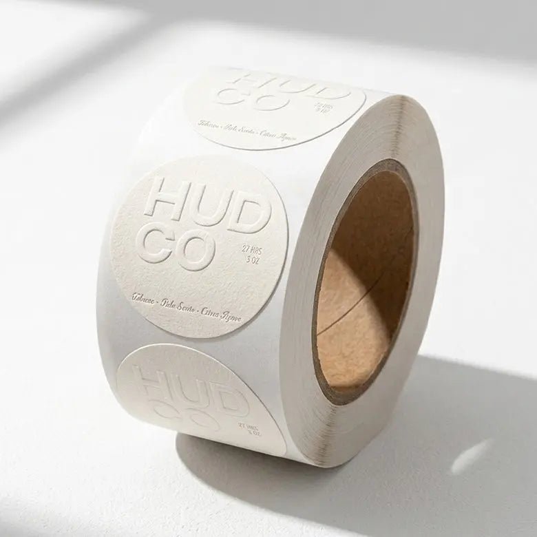
An artwork checklist for custom embossed stickers
- Separate production layers: print, white ink, foil, emboss, cut line and varnish should be unmistakable.
- Use vector artwork: keep logos and tactile shapes editable and fonts correctly managed.
- Respect the dieline: include the requested bleed, safe area and quiet space.
- Simplify the emboss: enlarge tiny gaps, remove fragile texture and protect letter counters.
- Name references: identify color and foil by the agreed physical system, not a screen screenshot.
- Describe the package: material, coating, curvature, application temperature and expected environment.
- Define the proof: specify which properties require physical sign-off before the run.
Environmental language should be equally disciplined. The FTC Green Guides summary recommends qualifying broad environmental benefit claims. “Paper,” “recyclable,” “compostable” and “plastic-free” are not interchangeable. Make only the claim supported for the complete label construction and its likely disposal context.
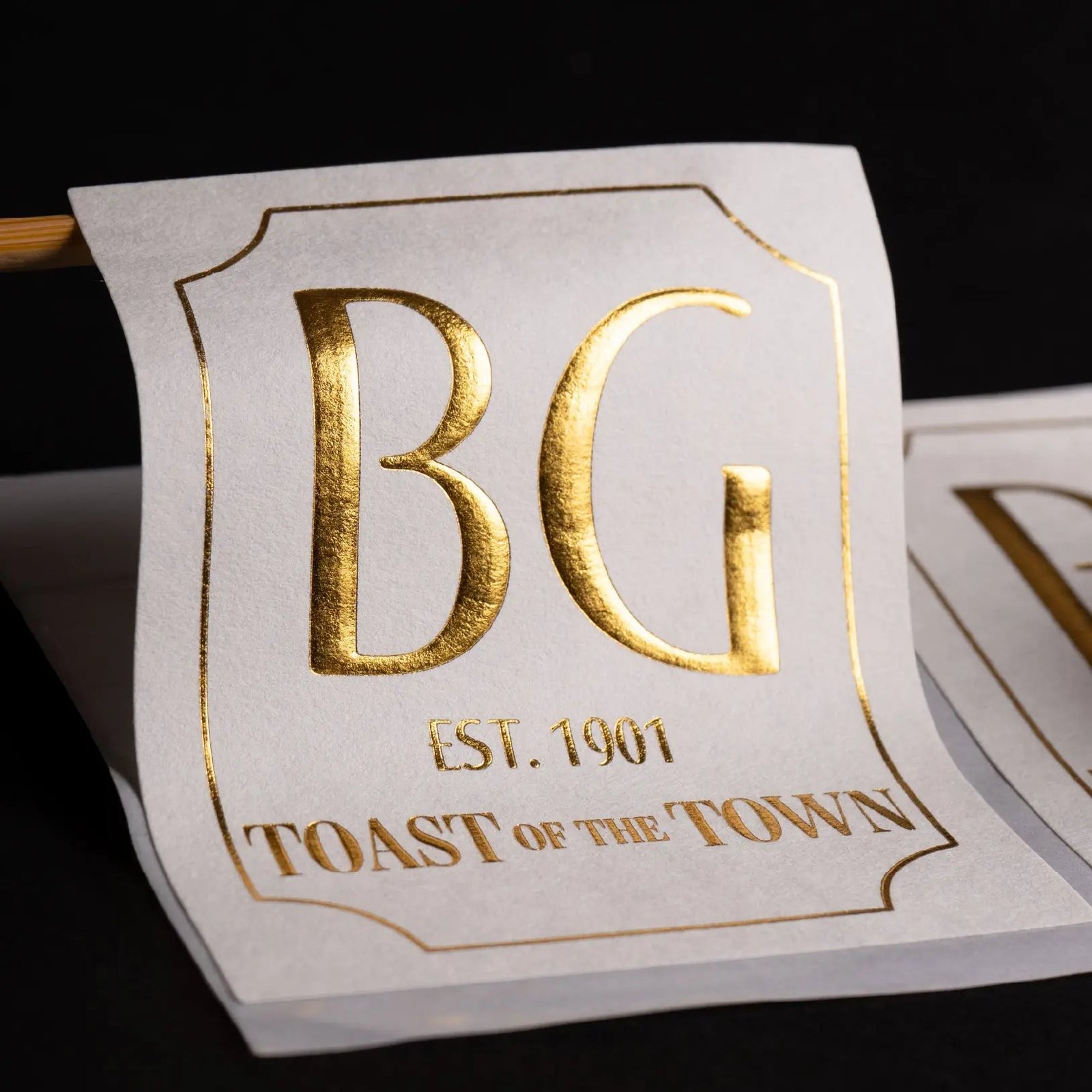
How should you approve the finished label?
Inspect the proof first as a customer would: at arm’s length, in normal lighting and on the real product. Then inspect technically. Check spelling, hierarchy, emboss direction, relief clarity, foil coverage, print registration, die-cut position and edge quality. Bend or wrap the label as it will be used. Apply it to the cleaned package and observe the bond under realistic conditions.
For the delivered batch, compare samples from the beginning, middle and end when possible. Record accepted tolerances before production so decisions do not depend on memory. If the label is one part of a larger packaging system, compare it with Stowliva’s tissue, stickers and seals options and paper packaging accessories.
Frequently asked questions
Can any logo be embossed?
Most logos can inspire an embossed version, but very fine lines, small counters, gradients and dense texture may need simplification. Ask for process-specific artwork limits and approve the adjusted mark before tooling.
Is blind embossing readable without ink?
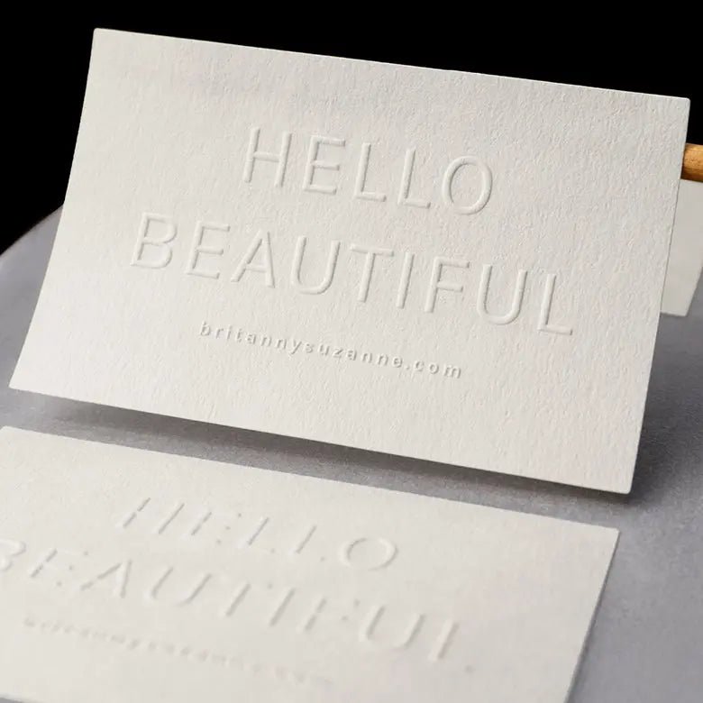
It can be, when relief, paper, scale, contrast and lighting work together. It is not ideal for every information layer. Keep essential small text printed and use the blind emboss as a tactile focal point.
Can embossed stickers wrap around bottles?
Possibly, but the stock, emboss depth, label size, bottle radius and adhesive must be tested together. A construction that looks excellent flat may resist a tight curve or lift at the edge.
Does foil always need embossing?
No. Flat foil can provide reflective color without relief. Foil plus embossing adds alignment and forming requirements. Choose the combination because it supports the design, not because more processes automatically create a better label.
What should a physical proof confirm?
At minimum: artwork content, emboss direction and clarity, material behavior, color or foil appearance, die-cut alignment, adhesive performance on the real surface and the overall impression under realistic lighting.
Build the label around the real package
The most convincing personalized embossed stickers are not flat graphics with a last-minute effect. They are small physical products designed around paper, relief, color, adhesive and the package beneath them. Clarify the process, protect space, test the actual surface and approve the result in your hand.
Ready to compare blind emboss, foil and printed combinations? Explore Stowliva’s custom embossed labels and request a quote with your dieline, package material and artwork.
Editorial note: The five images are existing Stowliva catalogue photographs of real products, not AI-generated artwork. Product specifications and claims should be confirmed for each order.